Earthnutri®
Earthnutri® Brand ReDesign
Transparent, Natural and Powerful. Those are the crucial ideas for brand Earthnutri.
As the visual designer, I recreated their packaging, website, social media, based on their original visual identity.
Earthnutri’s visual identity and bottle packagings was created 7 years ago, which most of the original files are disappeared during the time.
This project helped the brand to present their visual system more centrally, while discarding many old elements which were eliminated time by time.
Old packaging:


︎︎︎ Adobe illustrator
︎︎︎ Adobe Photoshop
︎︎︎ Adobe After Effect
︎︎︎ Photography
![]()
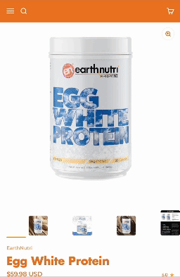
I redesigned their website, based on the previous one they have. Instead of using dark colors or the type of “cool” aesthetic, we try to embed the iconic orange to further deeped the brand impression.
brand video here
![]()
![]()
“The Power is in the Ingredients. ”
This is Earthnutri’s original belief and persistence. Therefore, we pay great attention to showcasing our excellect ingredients.
Since we only use the finest and branded ingredients, we try to focus our customer’s attention on these wonderful ingredients and attempt to restore the ingredients we use to their original state visualy.
![]()
![]()
︎︎︎ Adobe Photoshop
︎︎︎ Adobe After Effect
︎︎︎ Photography

I redesigned their website, based on the previous one they have. Instead of using dark colors or the type of “cool” aesthetic, we try to embed the iconic orange to further deeped the brand impression.
brand video here

“The Power is in the Ingredients. ”
This is Earthnutri’s original belief and persistence. Therefore, we pay great attention to showcasing our excellect ingredients.
Since we only use the finest and branded ingredients, we try to focus our customer’s attention on these wonderful ingredients and attempt to restore the ingredients we use to their original state visualy.